Client
Uber
Industry
Transportation
Service
UI / UX Design
Digital Design
Duration
6 Weeks

OverView
This project focuses on enhancing the Uber rider experience by addressing a key pain point: wait time uncertainty. Many users experience frustration due to limited updates and a lack of visibility while waiting for their ride.
The proposed features aim to improve transparency and engagement through real-time updates, interactive elements, and opportunities for social connection. By rethinking the waiting experience, the design shifts it from passive and uncertain to informed and engaging.
The solution emphasizes clarity, trust, and user control, creating a more seamless and reassuring experience within the existing Uber ecosystem.

The problem
While Uber provides a convenient way to request rides, the experience during wait times can feel uncertain and disconnected. Users often have limited visibility into delays and are left without clear communication or engagement while waiting for their ride.
This lack of transparency and interaction can create frustration and anxiety, especially in situations where timing and safety are important. There is an opportunity to improve the experience by making wait times more transparent and introducing features that keep users informed and engaged throughout the process.
COMPETITIVE analysis
To understand how current rideshare platforms support users during wait times, I conducted a competitive analysis of Lyft, Curb, and Via. While each platform provides reliable transportation and basic status updates, they offer limited clarity and engagement when delays occur. Across all three, communication tends to be minimal or unclear, leaving users feeling uncertain during the waiting experience. These gaps highlight an opportunity to improve transparency and create a more supportive, informative experience.

research
USER INTERVIEWS
I conducted secondary research by reviewing Uber’s product experience, advertising, and platform insights to understand how it communicates with users. I also explored scholarly research on user behavior, waiting, and uncertainty, and analyzed competitors like Lyft, Curb, and Via. This helped identify gaps in transparency, communication, and engagement during wait times.
To better understand user behavior and expectations, I conducted interviews with four individuals who regularly use rideshare services. The conversations focused on their experiences during the waiting period, including how they interpret delays, their level of trust in the app, and how they feel while waiting for a ride.
Across all participants, a common theme emerged around uncertainty and lack of communication. Users expressed frustration when wait times were unclear or changed without explanation, and many noted that the experience felt passive, with little engagement or reassurance from the platform.
USER INTERVIEWS

key insights
• Mixed Uber Usage- weekly, monthly, commuting
• Major Themes- Convenience, Price, Safety, Reliability, Driver Experiences, etc.
• Improving Wait-Time - Clear reason for delays, real-time communication, etc.
• Social Feature - Quiet Mode and Amenities
Feature Concepts
Based on research insights, I explored multiple feature concepts to improve the waiting experience in Uber. Each concept focuses on reducing uncertainty, increasing transparency, and introducing optional engagement to make wait times feel more manageable and user-centered.

Mid-fidelity wireframes
I developed mid-fidelity wireframes to explore how key features would function within the Uber experience. These screens focused on improving wait time transparency, introducing optional communication through chat, and adding light engagement through a simple game feature. I also explored a social mode that allows users to customize their level of interaction. This phase helped refine the structure, interactions, and overall flow before moving into high-fidelity design.


Concept testing user feedback
I conducted quick concept testing to gather feedback on early feature ideas, including wait time transparency, chat, game interaction, and social mode. Feedback indicated that users valued clearer communication around delays and appreciated having optional ways to engage while waiting.
Participants responded positively to features that reduced uncertainty without overwhelming the experience. The social mode concept was especially important, as users wanted control over their level of interaction. These insights helped refine the direction of the final solution, focusing on clarity, flexibility, and user control.

The Solution
After synthesizing research insights, I explored multiple directions to address gaps in transparency, communication, and engagement during wait times. My goal was to create solutions that felt both informative and supportive, reducing uncertainty while improving the overall user experience.
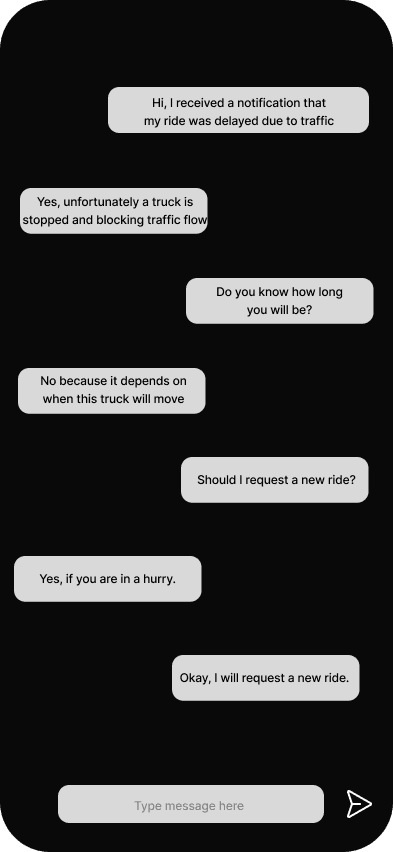
Concept 1: Wait Time Transparency & Communication
Providing users with clearer, real-time explanations for delays through contextual updates and proactive status messages, helping them better understand what is happening without needing to take action. This reduces uncertainty and builds trust throughout the waiting experience.
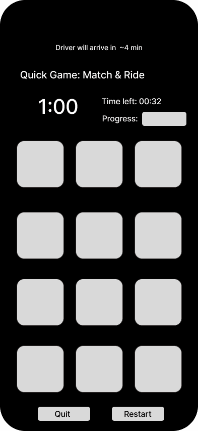
Concept 2: Optional Engagement Through Game
Offering a lightweight, low-stakes game to help pass time, reducing perceived wait length and making the experience feel less passive.
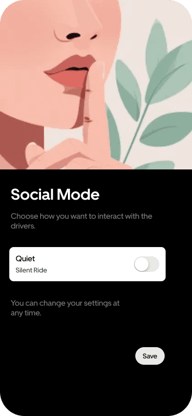
Concept 3: Social Mode Preferences
Giving users control over their level of interaction by allowing them to opt in or out of communication, ensuring a more personalized and comfortable experience.
High-fidelity design
The high-fidelity designs focus on key moments within the experience rather than a complete end-to-end flow. These screens highlight how core features, including wait time transparency, communication, and optional engagement, integrate into the existing Uber experience.
Each design explores a specific interaction or state, demonstrating how the solution improves clarity, reduces uncertainty, and creates a more supportive waiting experience.


The Result
The final solution creates a more transparent and supportive waiting experience by addressing key gaps in communication and uncertainty. By introducing clearer delay explanations, proactive updates, and optional engagement features, users are better informed and feel more in control throughout the process.
This project highlights the importance of designing for moments between actions, not just core tasks. Focusing on clarity, reassurance, and user control can significantly improve how an experience is perceived, even during unavoidable wait times.
If I were to continue this work, I would further explore personalization, real-time data integration, and user testing to refine and validate these features.
